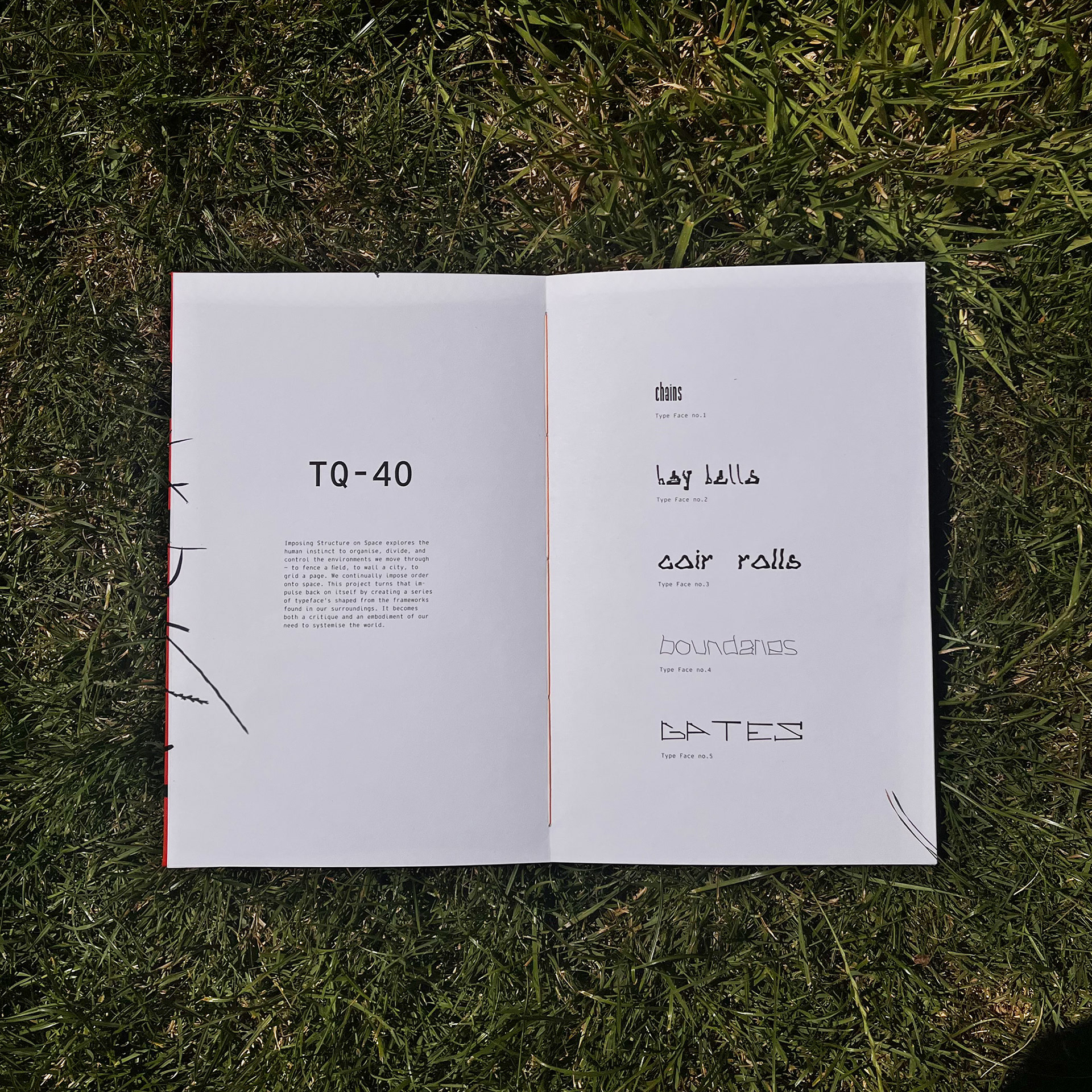
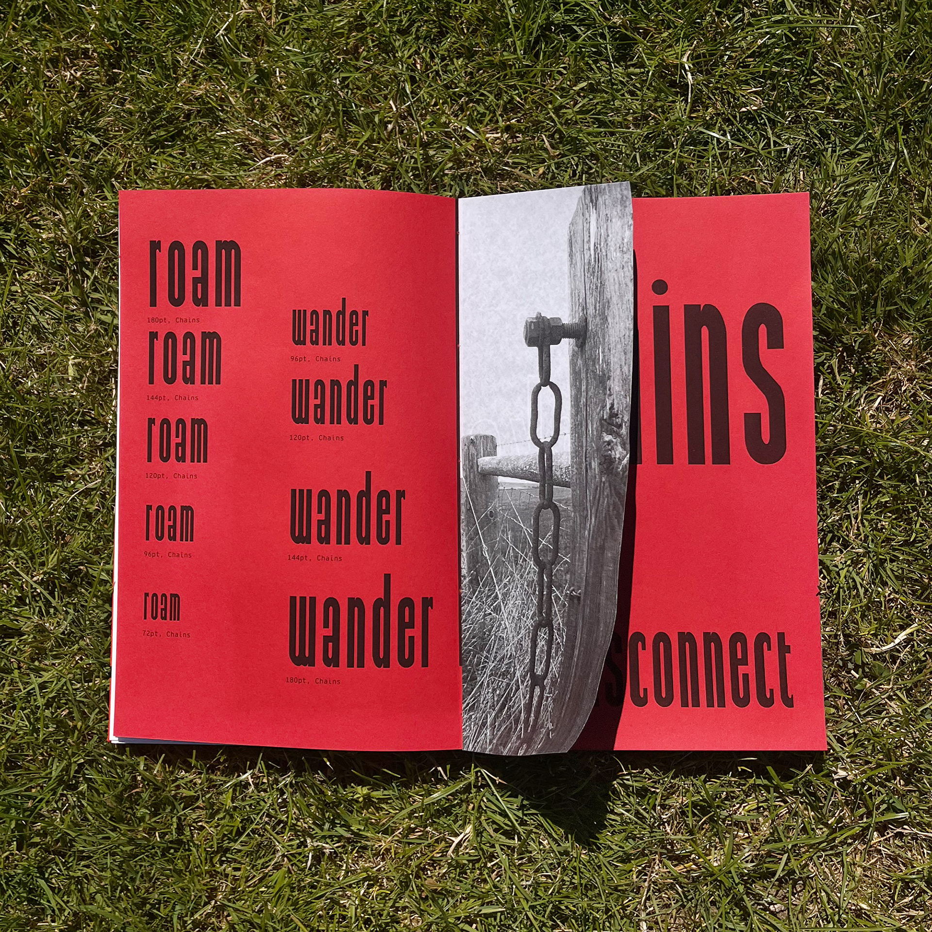
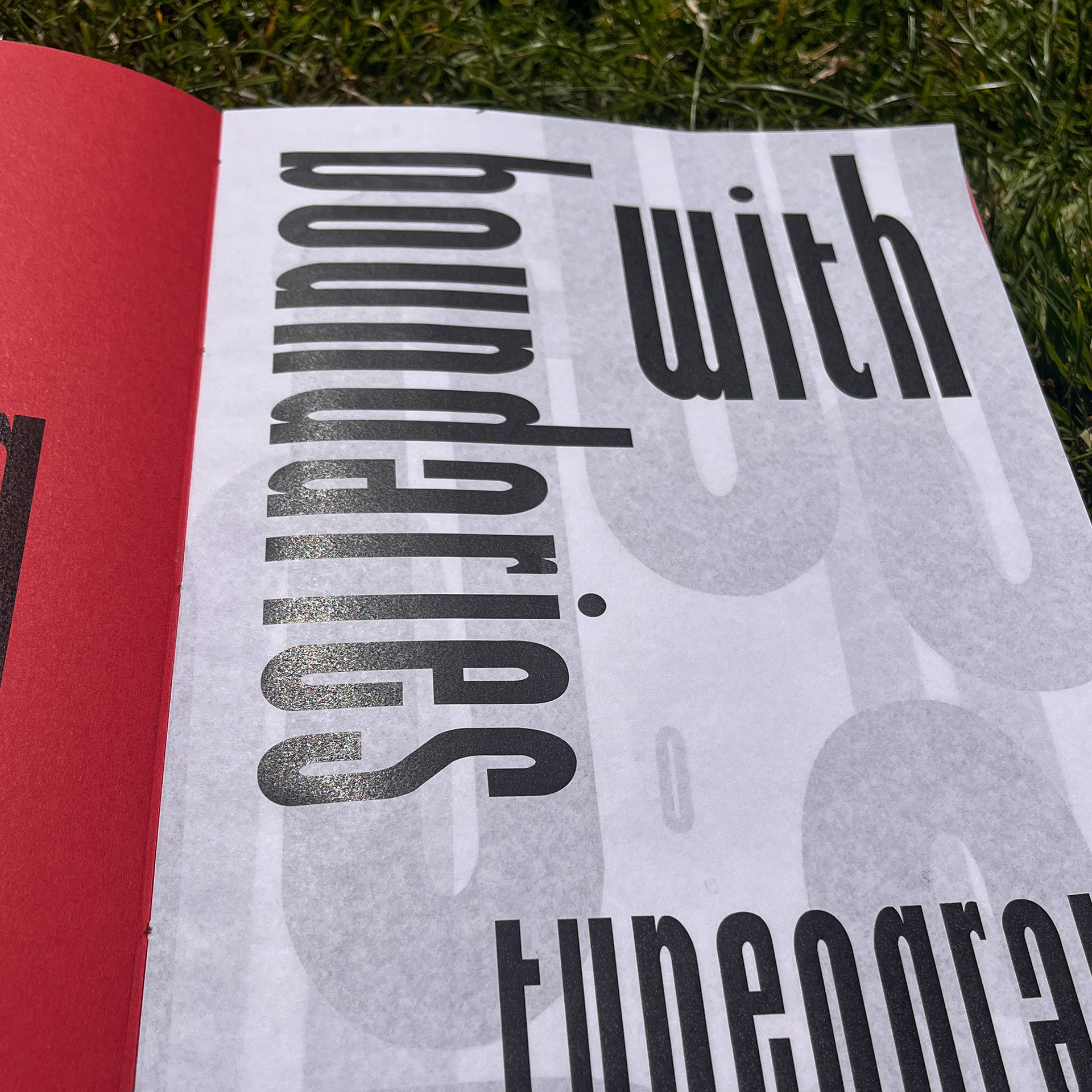
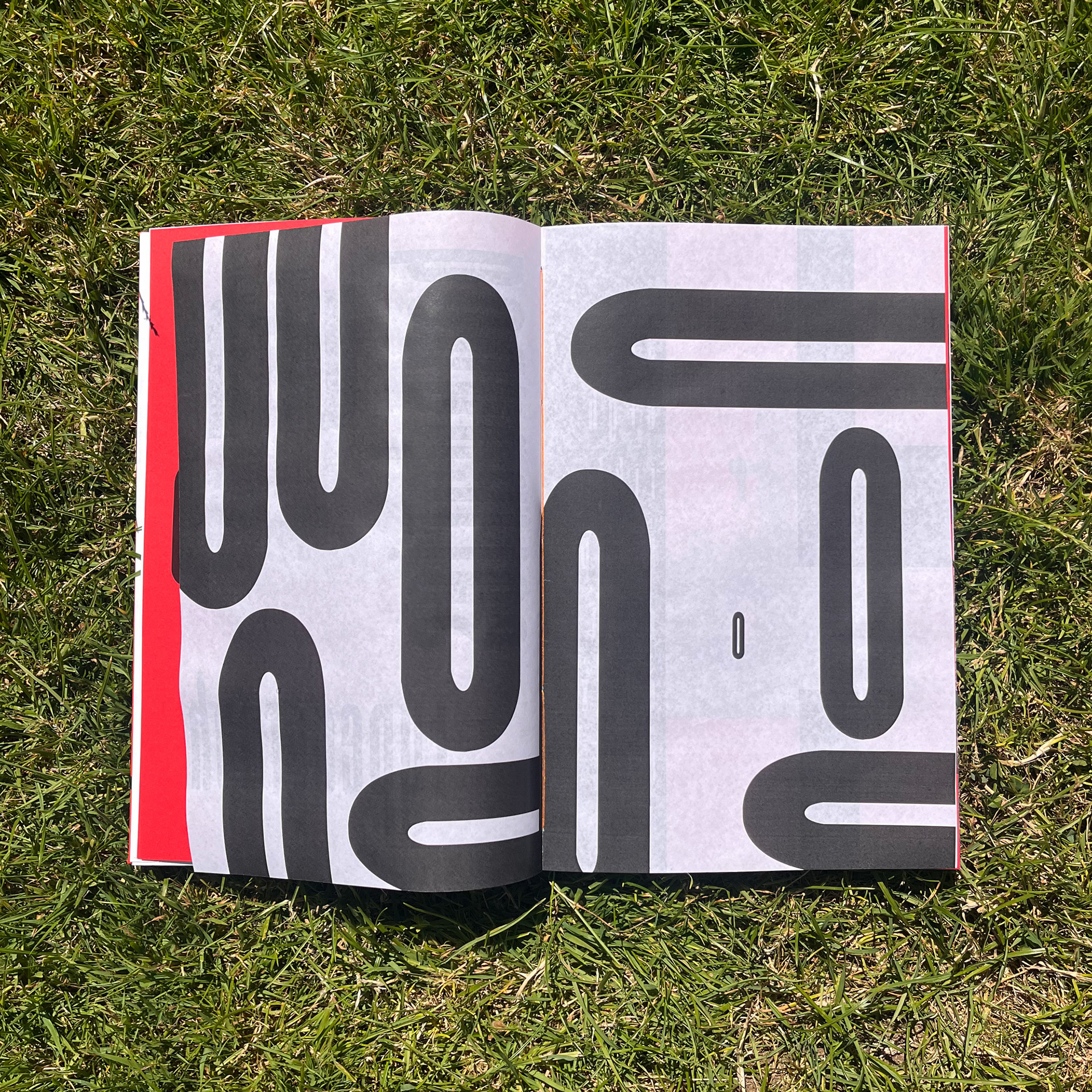
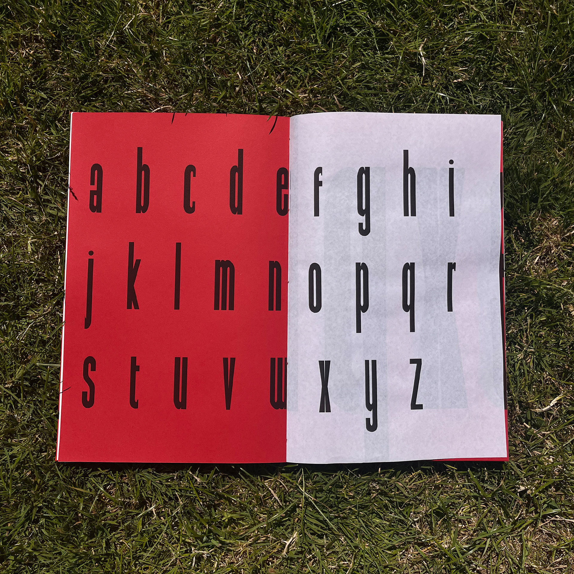
Full “Chains” alphabet spread across two paper stock, within a grid, clearly showing the individual characters.
Animation created to demonstrate the design process and thinking behind my typeface, "Chains".
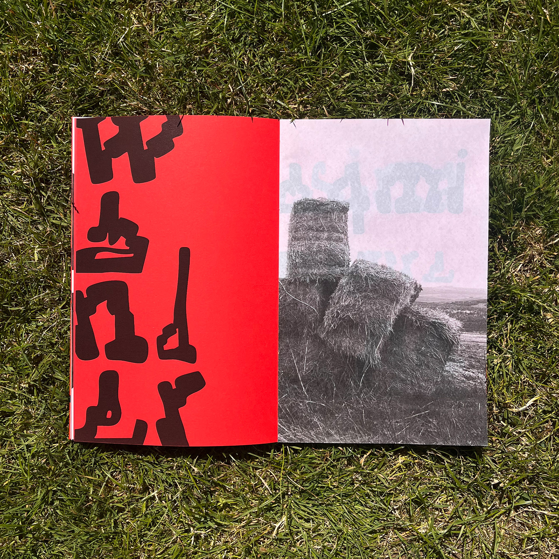
Decorative use of the “Hay Bales” typeface alongside the original image inspiring the typeface.
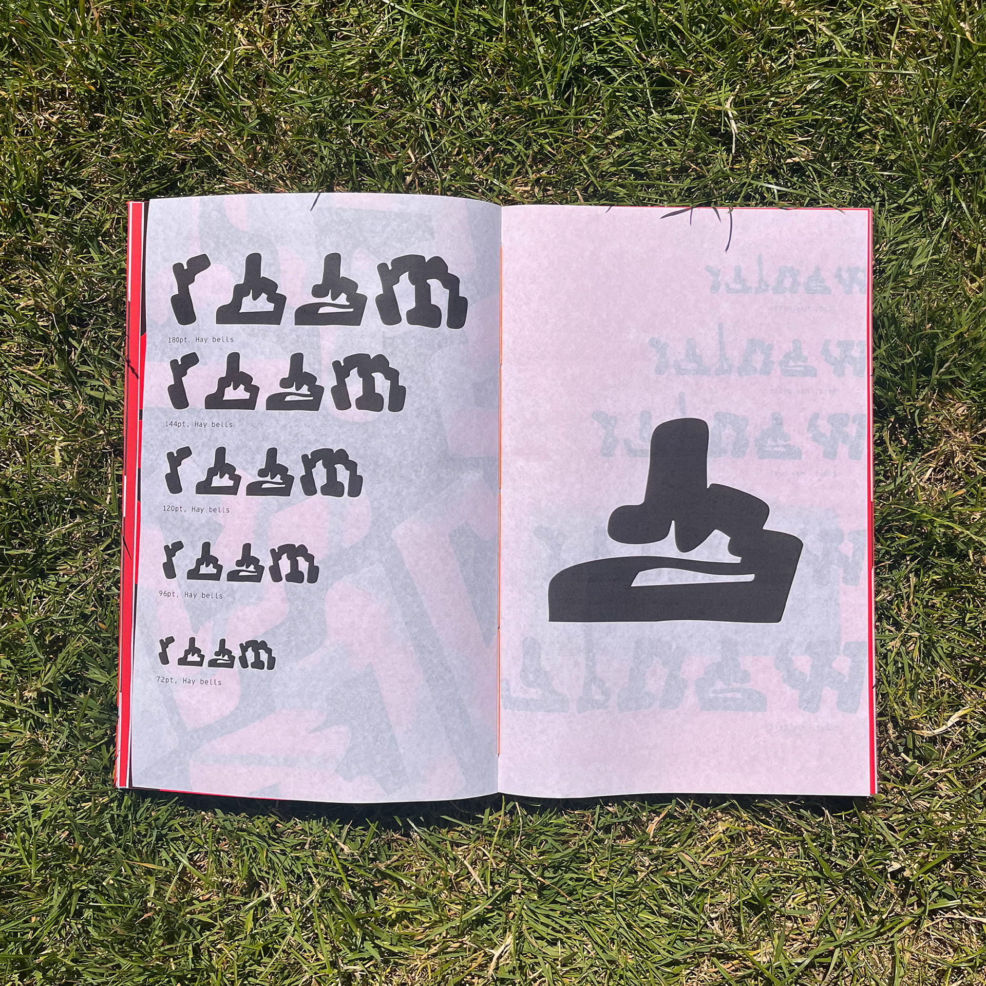
Typeface shown in variety of sizes and the letter “a” aligned to an image of hay bales on the next page.
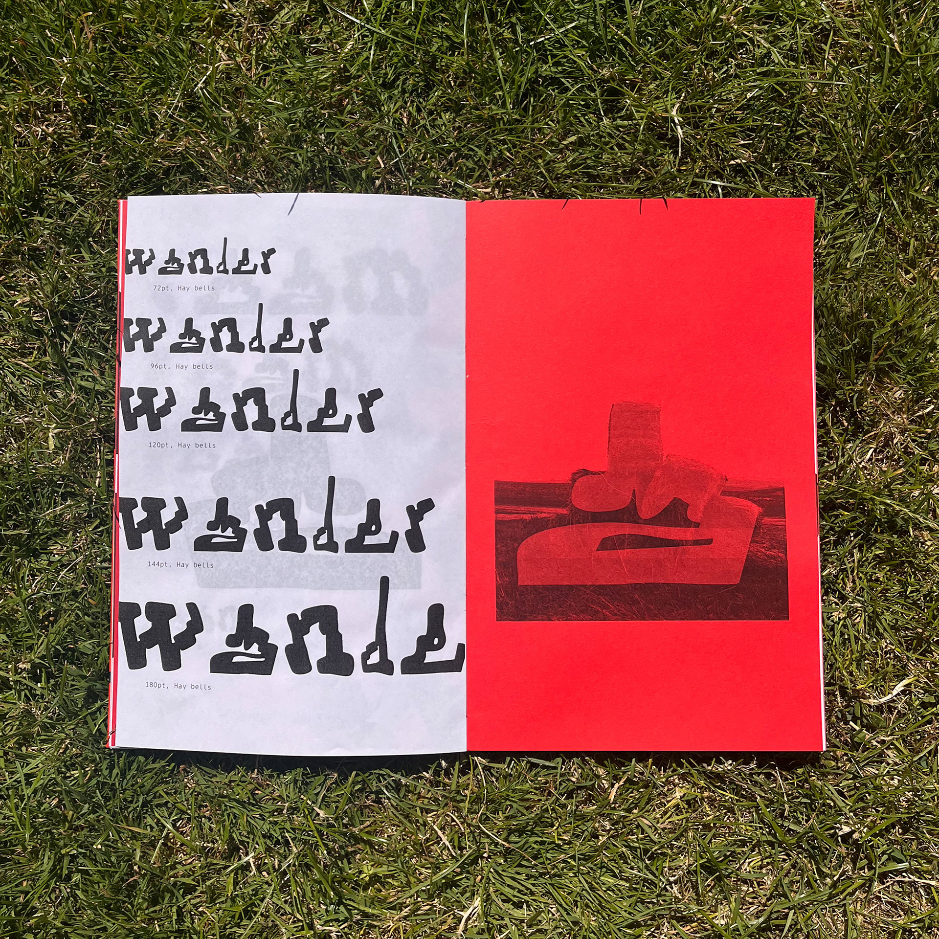
Typeface shown in variety of sizes and the letter “a” aligned to an image of hay bales on the next page.
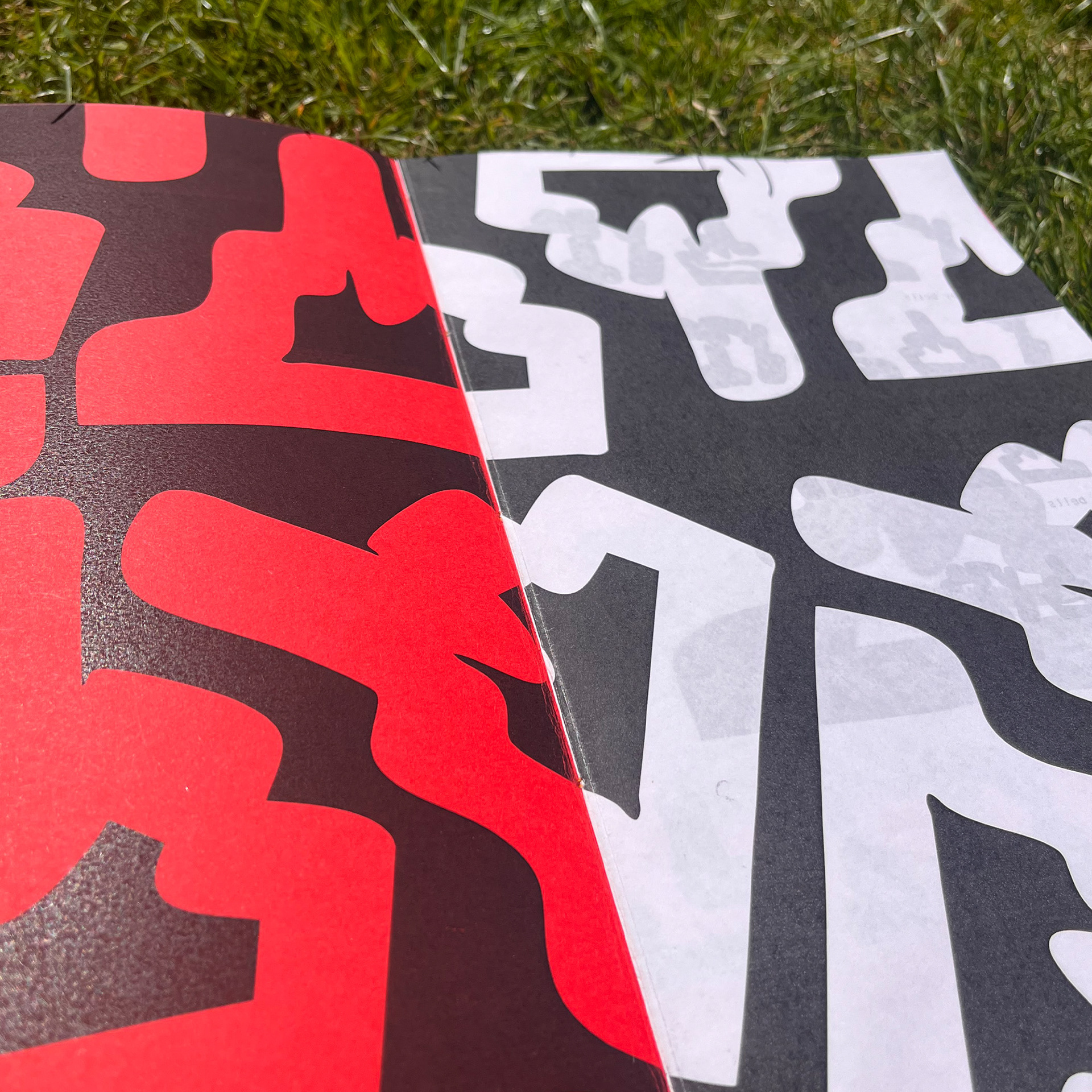
Expressive use of the letter “O” from the “Hay Bales” typeface shown over two paper stock.
Animation created to demonstrate the design process and thinking behind my typeface, "Hay Bales".
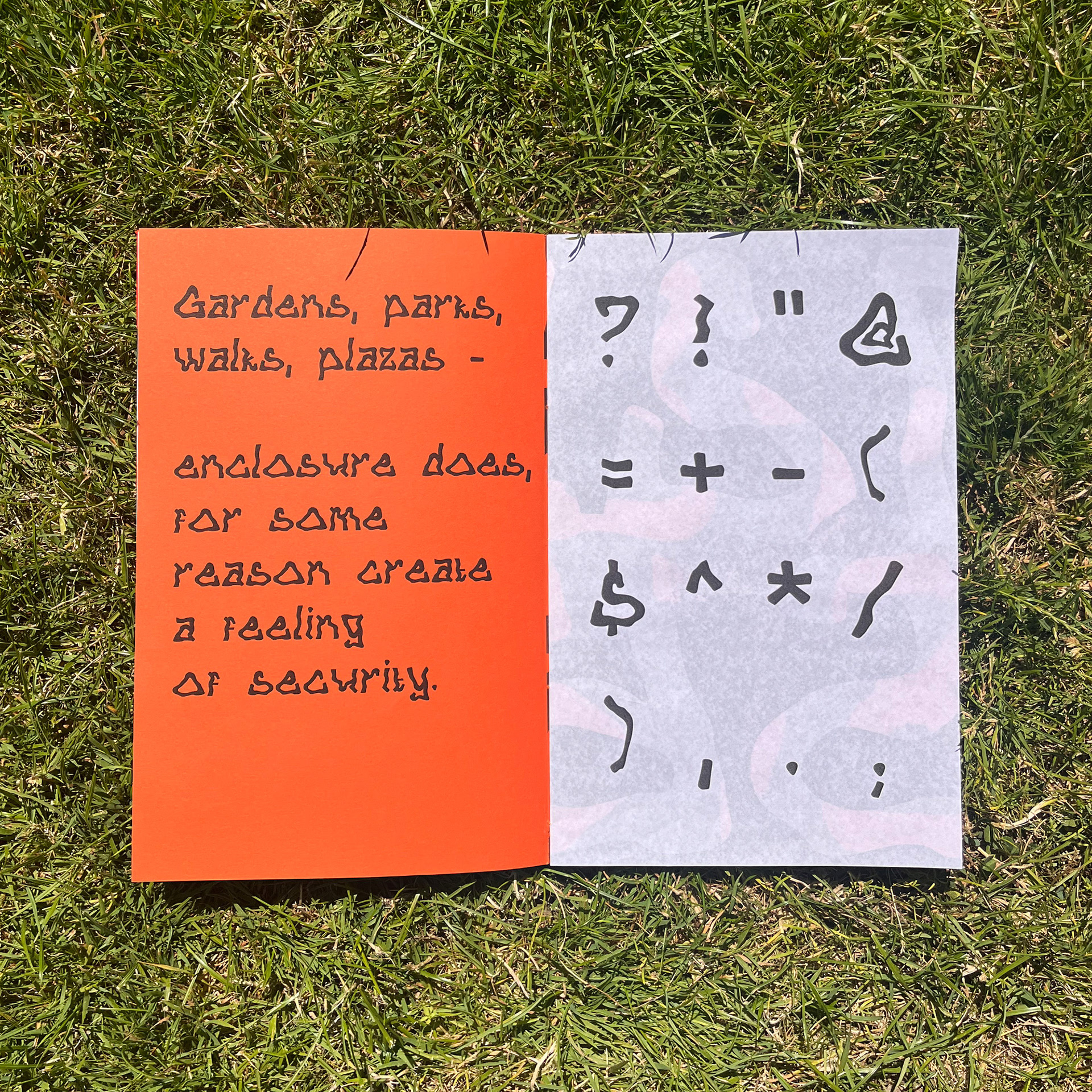
Quote from A Pattern Language, Christopher Alexander 1977 along side glyphs in “Coir Rolls” typeface.
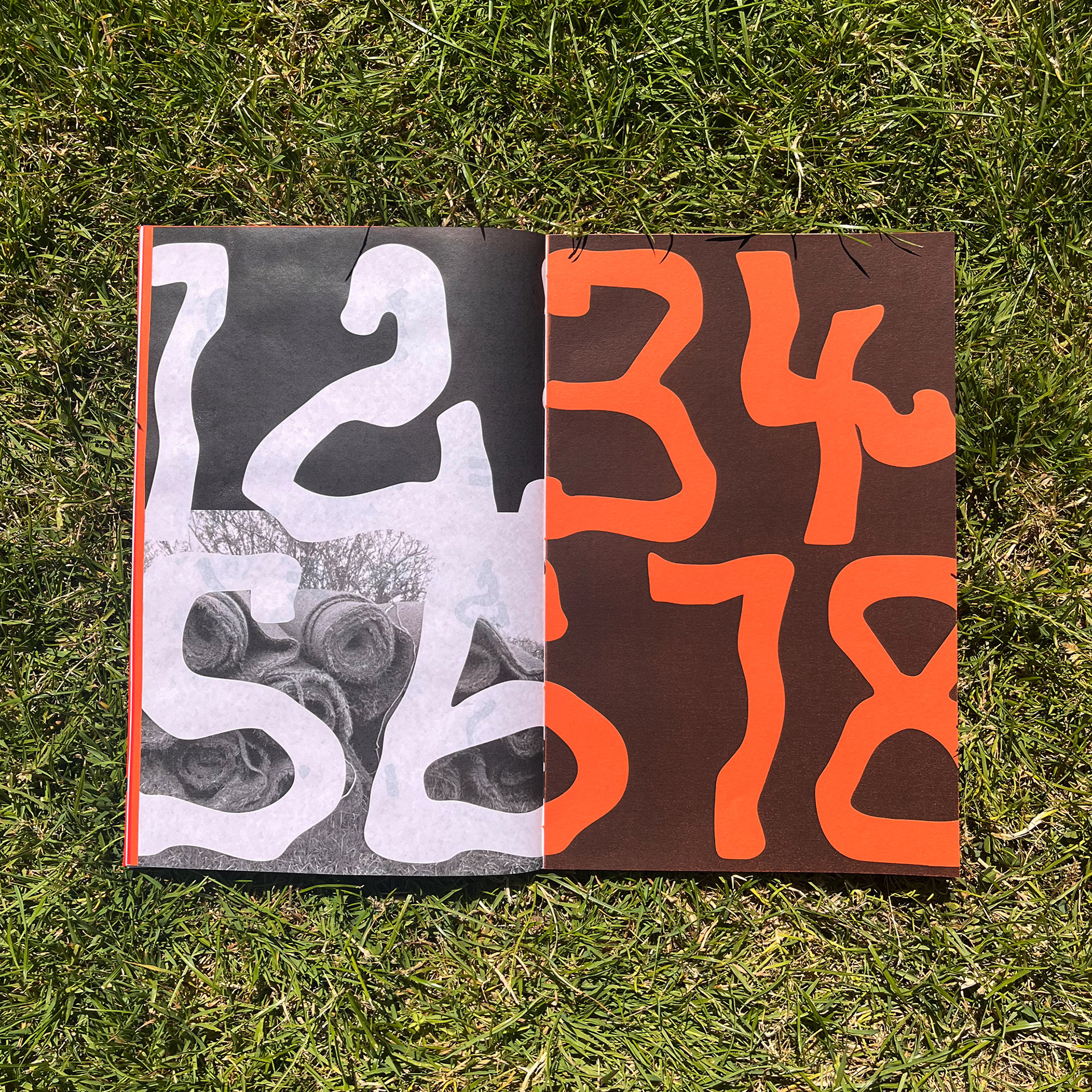
Double spread showing numbers and the image of coir rolls I took, which inspired the typeface.
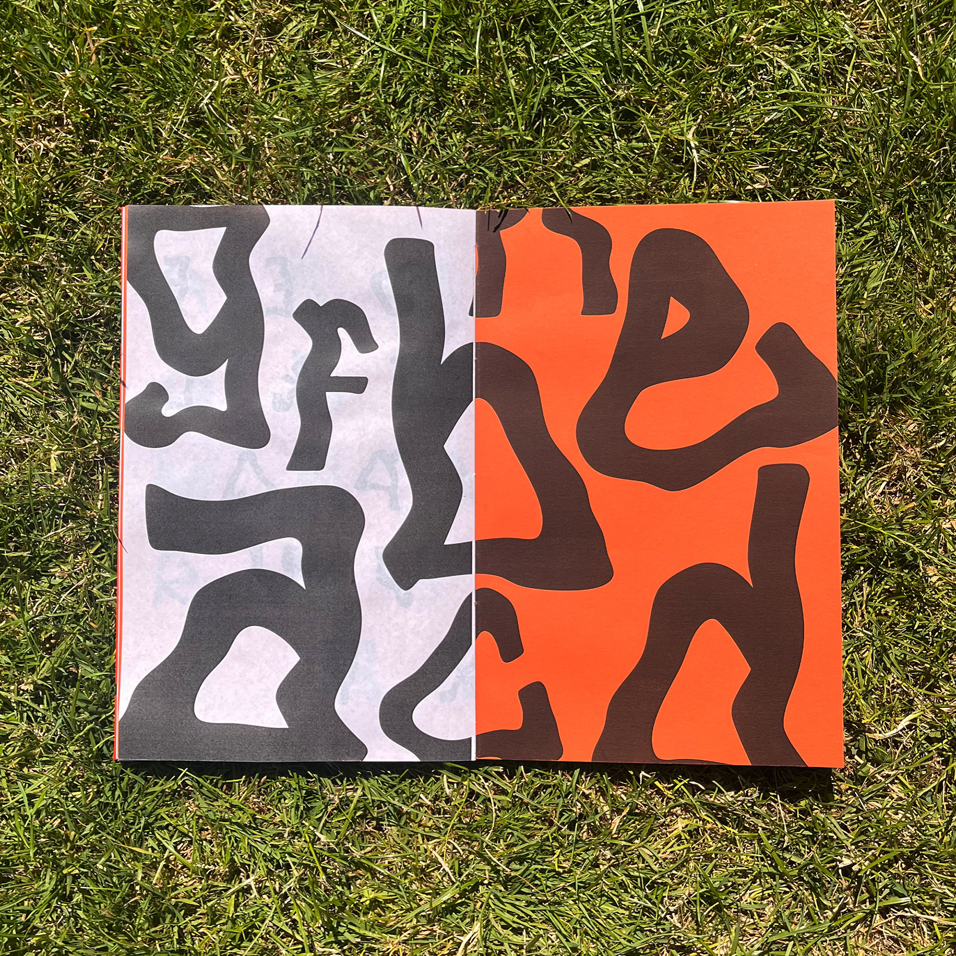
Double spread over two paper stock displaying individual letters in an dynamic format.
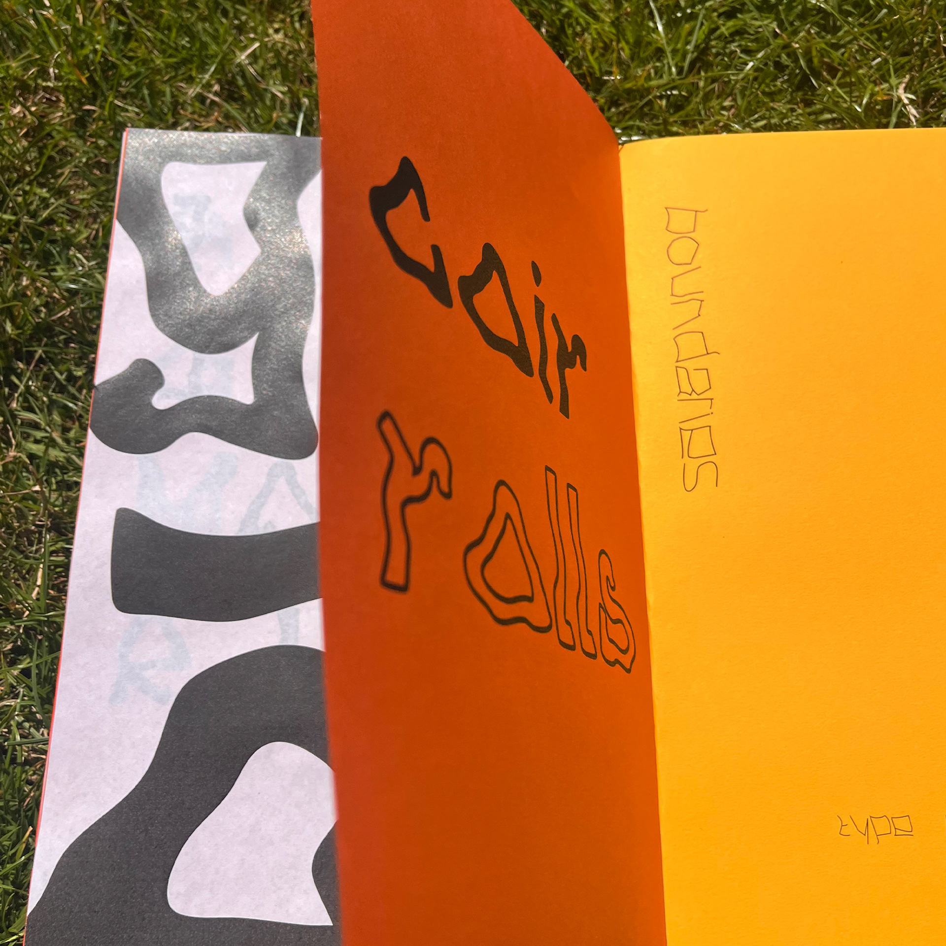
Multiple pages seen as the page turns to the final page of the “Coir Rolls” section.
Animation created to demonstrate the design process and thinking behind my typeface, "Coir Roles".
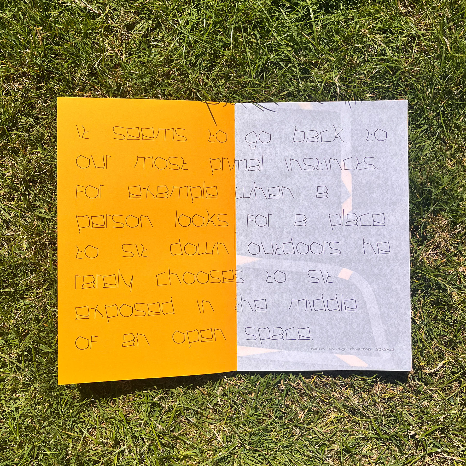
Quote from A Pattern Language Christopher Alexander 1977 demonstrating “Boundaries” typeface in use.
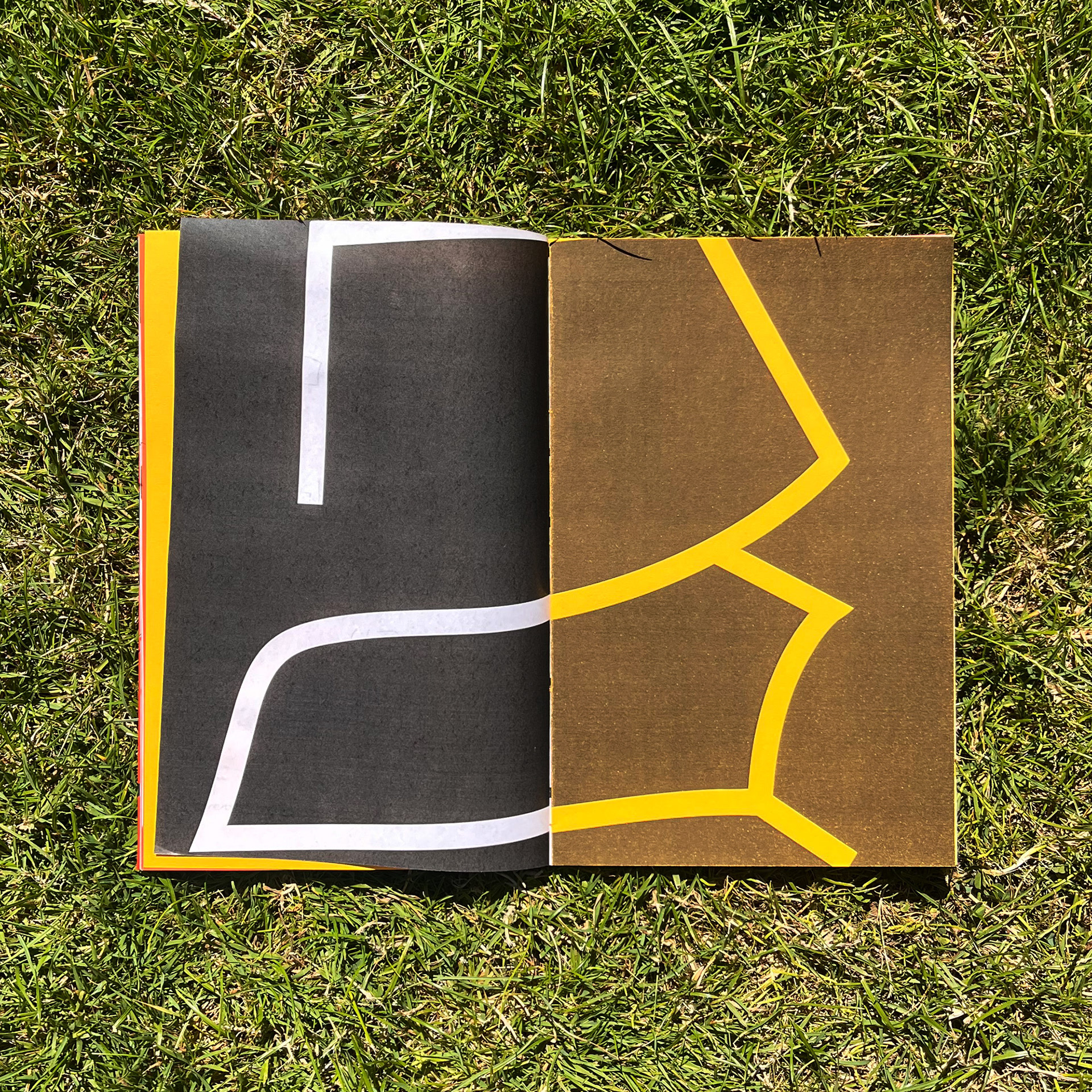
Double spread over two paper stock displaying an individual letter “ a” in a large format.
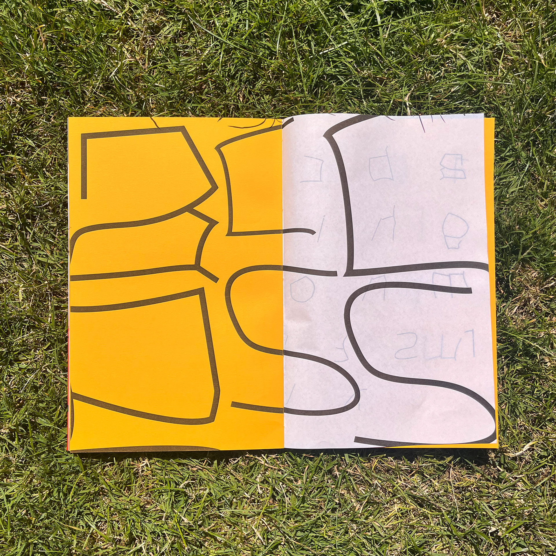
Double spread over two paper stock displaying individual letters reading “ accsess” in a large letters.
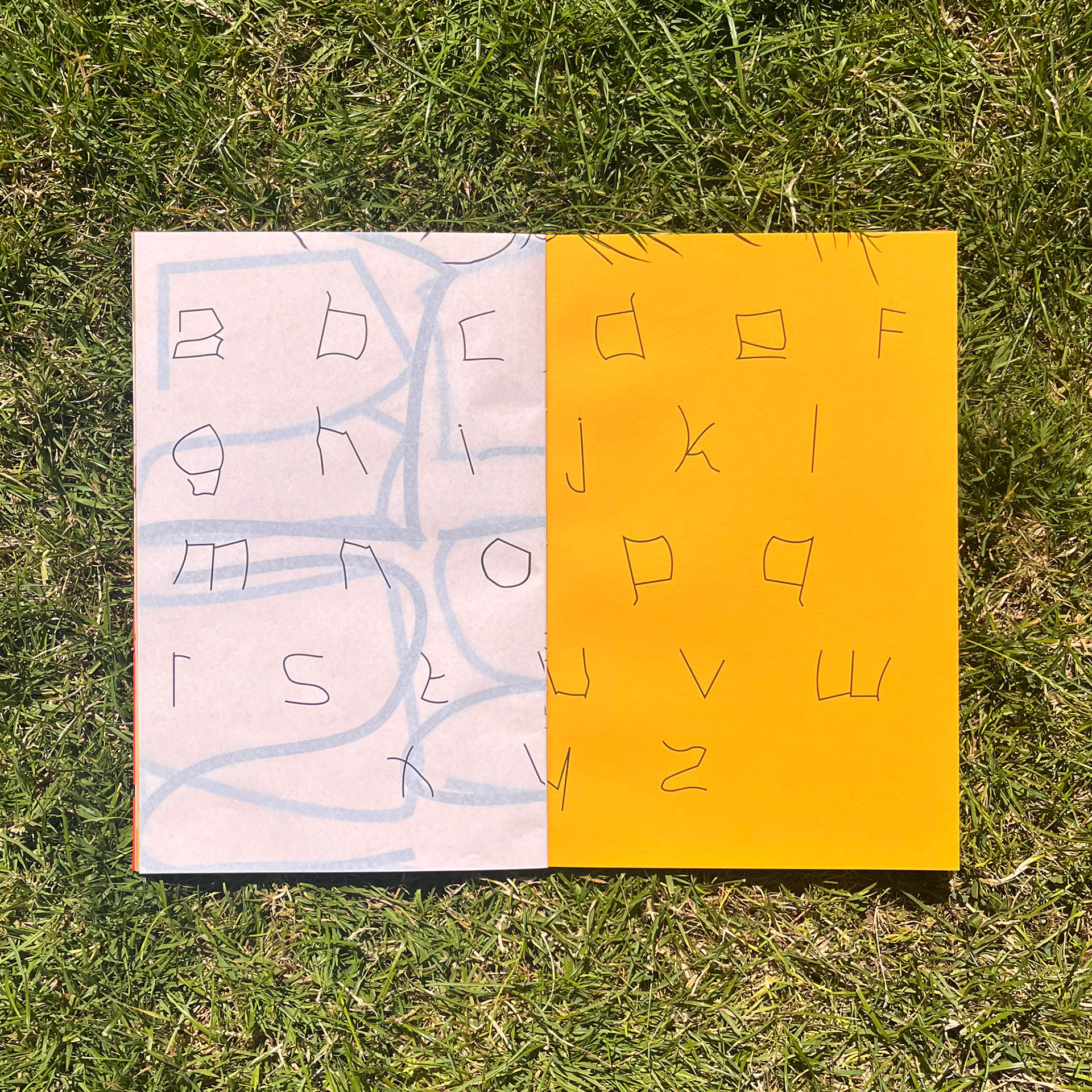
Full “Boundaries” alphabet spread across two paper stock, clearly showing the individual characters.
Animation created to demonstrate the design process and thinking behind my typeface, "Boundaries".
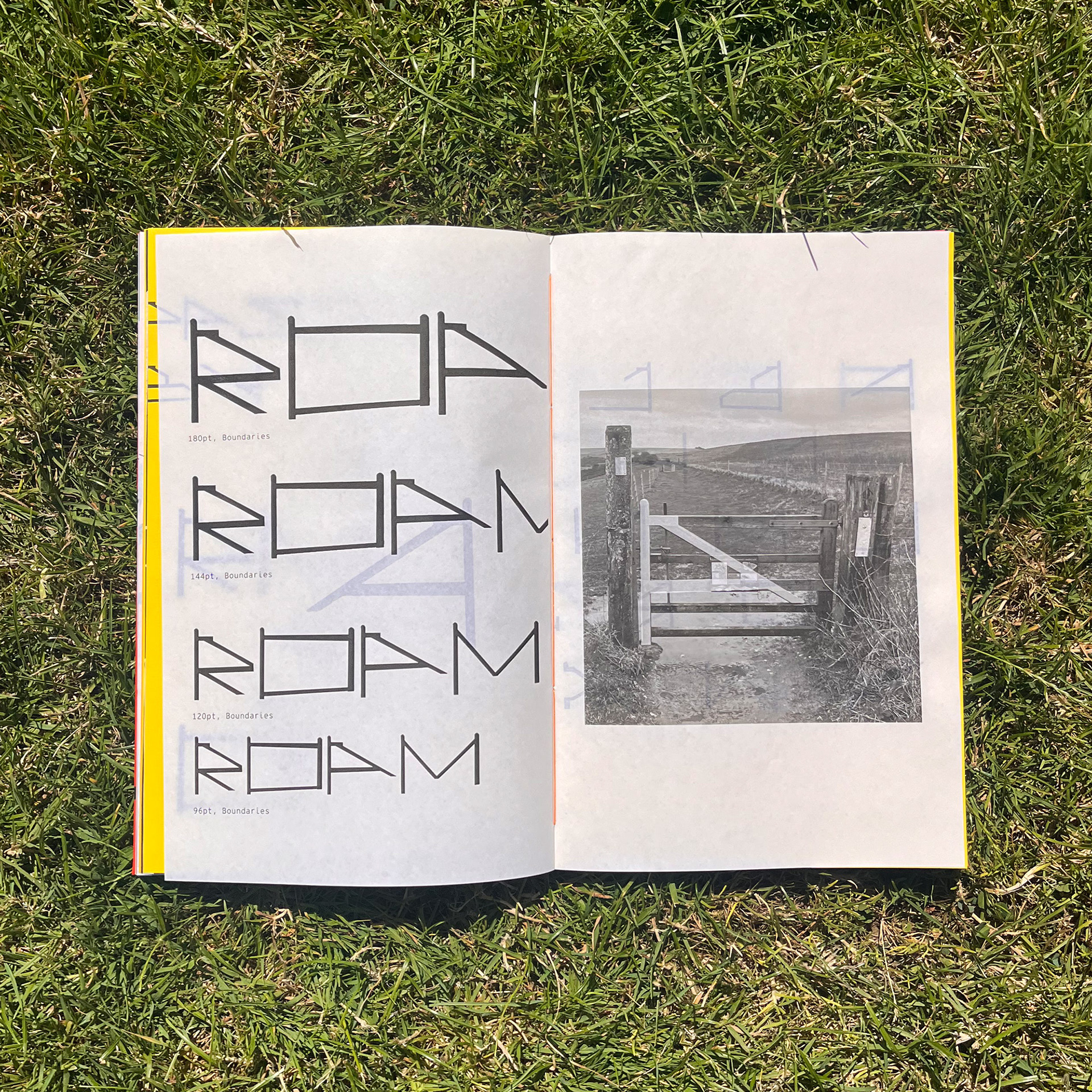
“Gates” typeface in multiple type sizes with image illustrating the design process from my original gate photo.
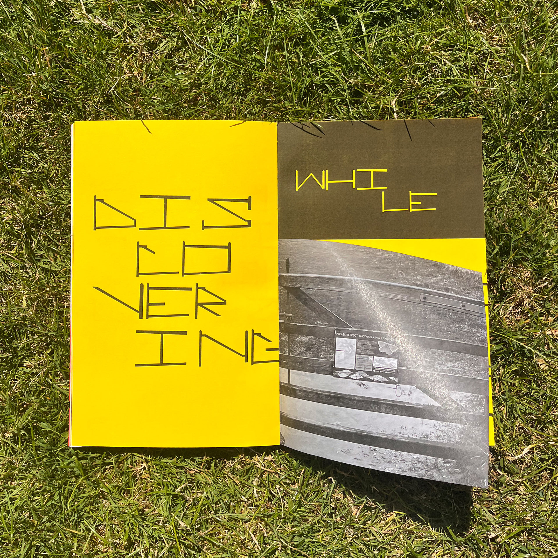
A half page which opens showing the “Gates” typeface in multiple use cases, including type size information.
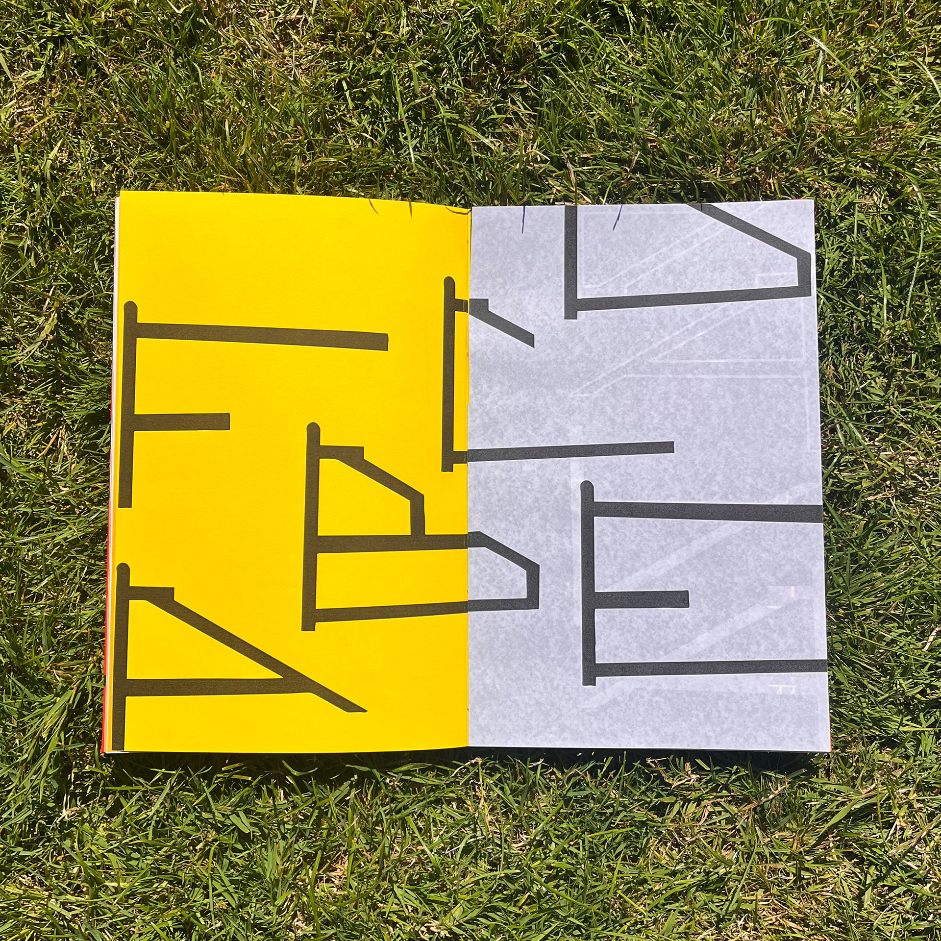
Double spread over two paper stock displaying individual letters in a large format.
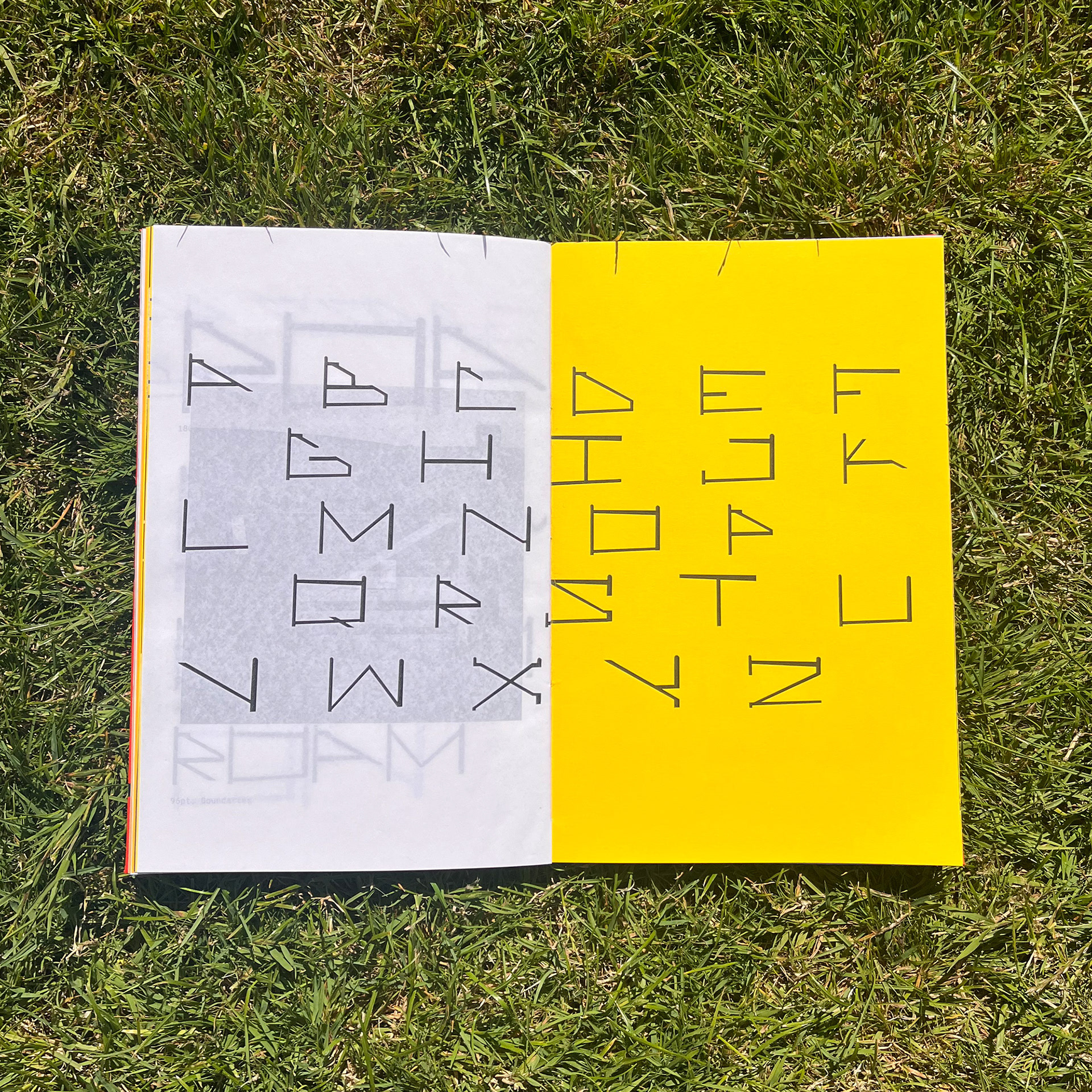
Full “Gates” alphabet spread across two paper stock, within a grid, clearly showing the individual characters.
Animation created to demonstrate the design process and thinking behind my typeface, "Gates".