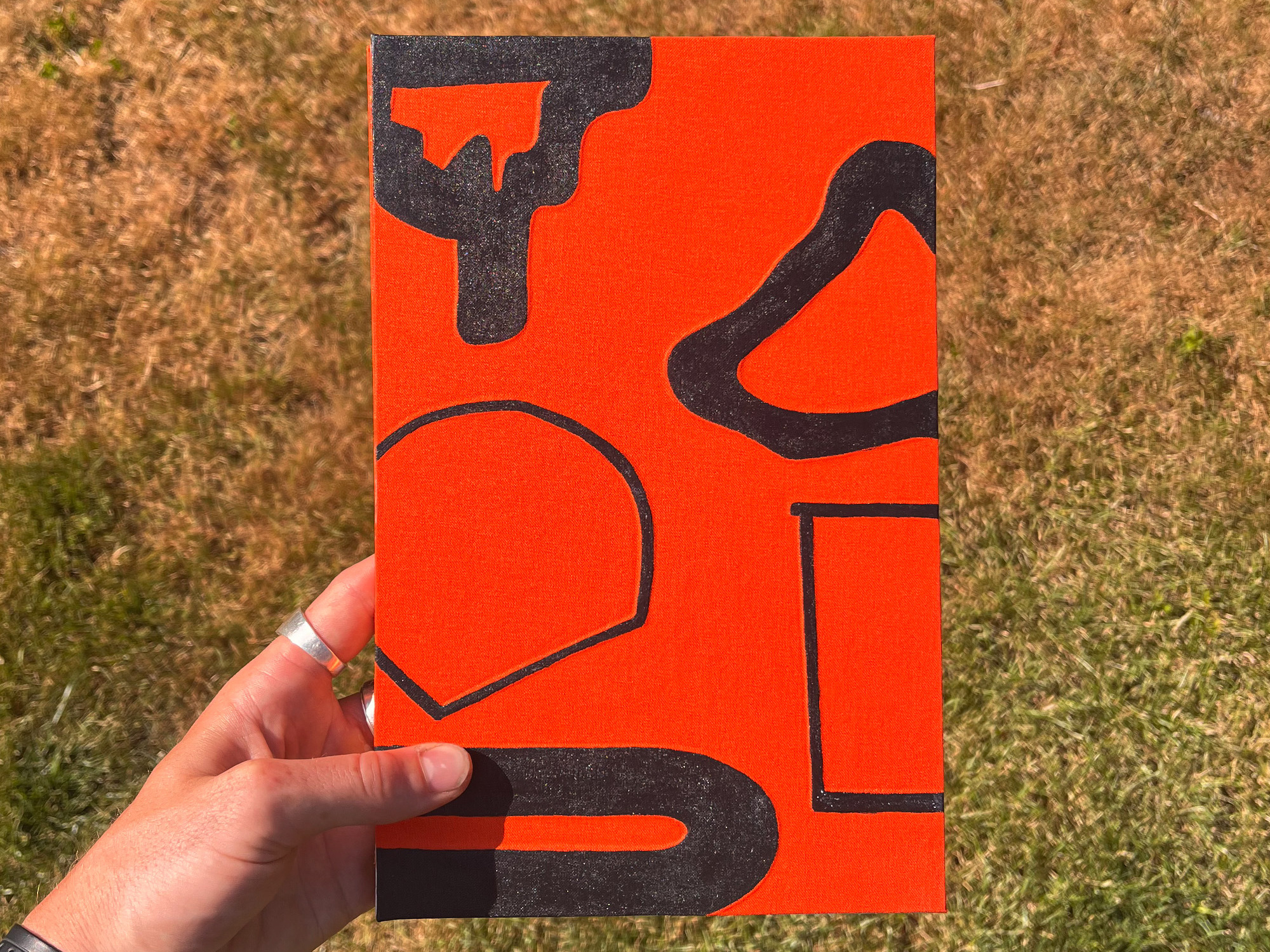
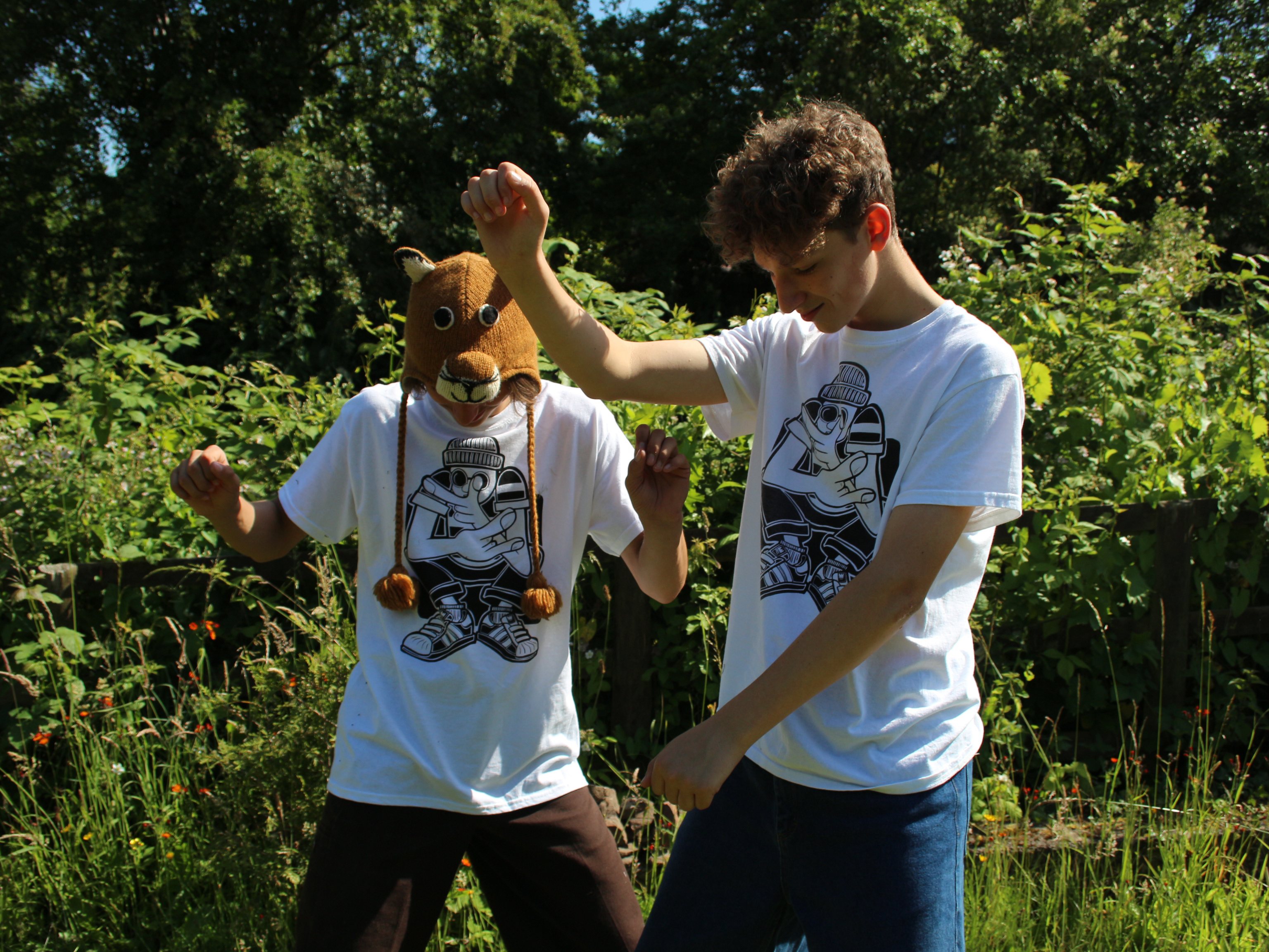
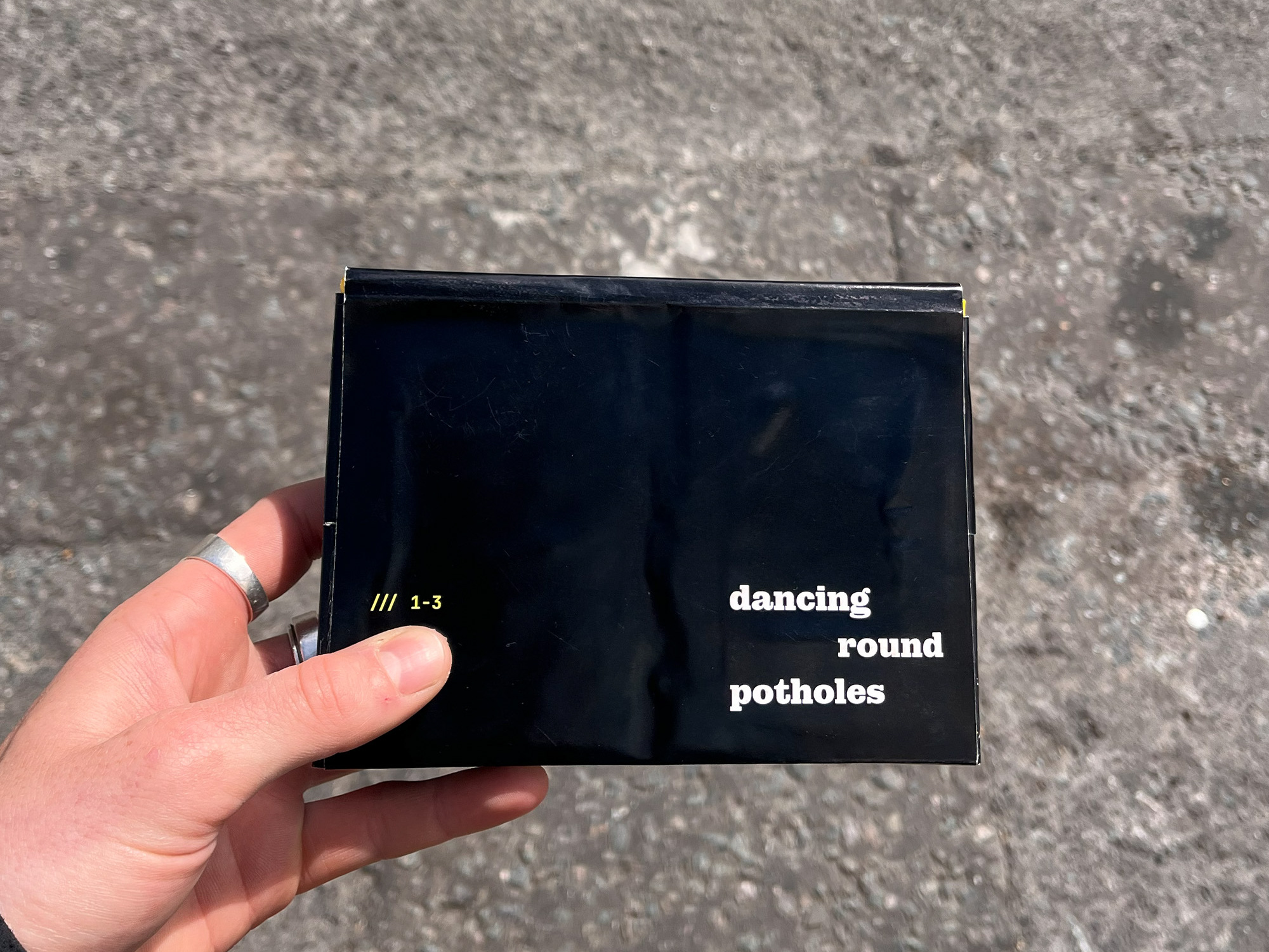
This project was a university brief. We were required to contact a graphic designer of interest, then interview them, using the interview dialogue to create an outcome. I interviewed Antoine Laurent (SELAH). He interested me because of his past in carpentry, skateboarding and graffiti, which I relate to. I chose to create a publication designed to be discovered within an urban setting.
Through experimentation with textures, materials, and street-inspired graphic techniques, including screen printing, acrylic paint, solid paint markers, tagging mops, and spray paint. I explored the visual language of graffiti and contemporary street culture. The project challenged me to work with precision while embracing the expressive qualities of these media, requiring careful control and accuracy within defined constraints.
For this project, I wanted a typeface that related to graffiti, and was legible in a printed format. I compared typeface’s with elements of hand drawn letter forms. I discovered the typeface Alegreya, which for me, pulled these elements together well with its calligraphic stylistic elements.
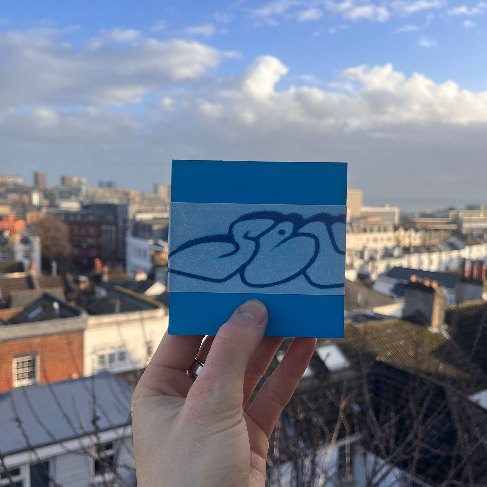
Front cover of the Design Dialogues publication, containing an interview with Antoine Laurent (SELAH).
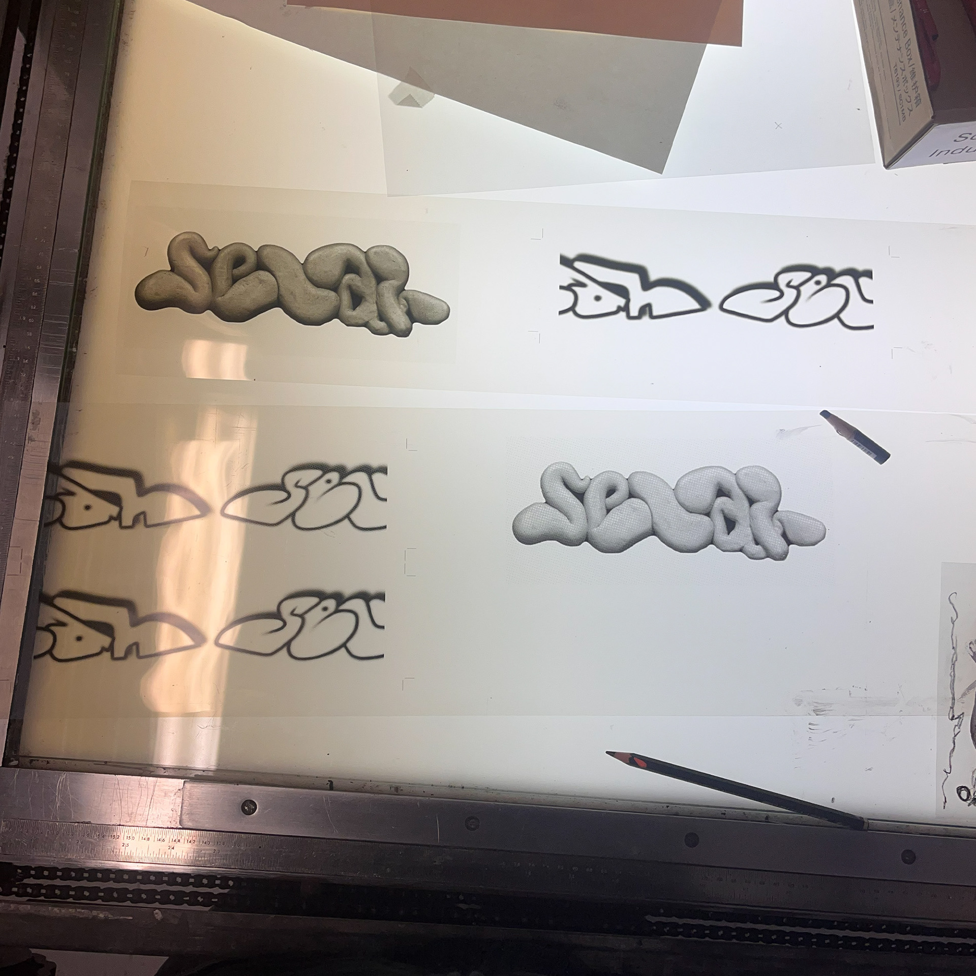
Printed acetate used to expose the screens for my publication’s screen printed belly band.
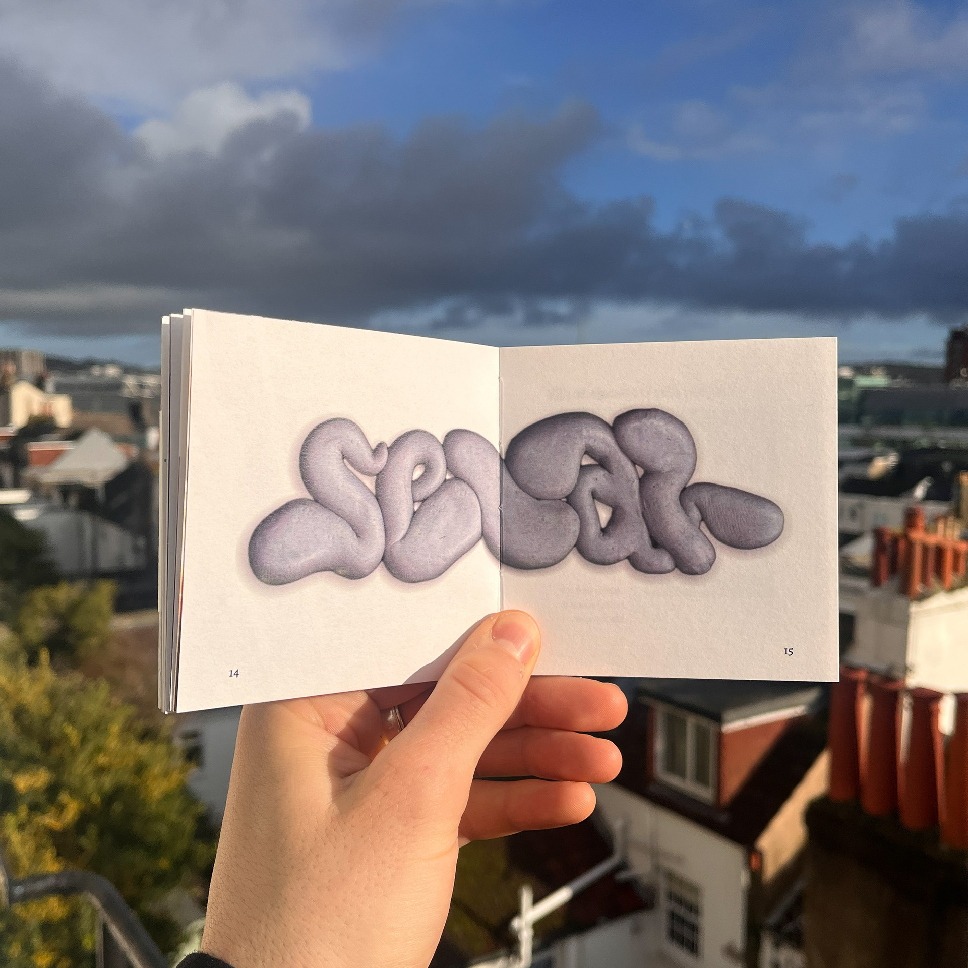
Double page spread with scanned in “selah” BlueTac graffiti printed on 130gsm Seawhite cartridge paper.
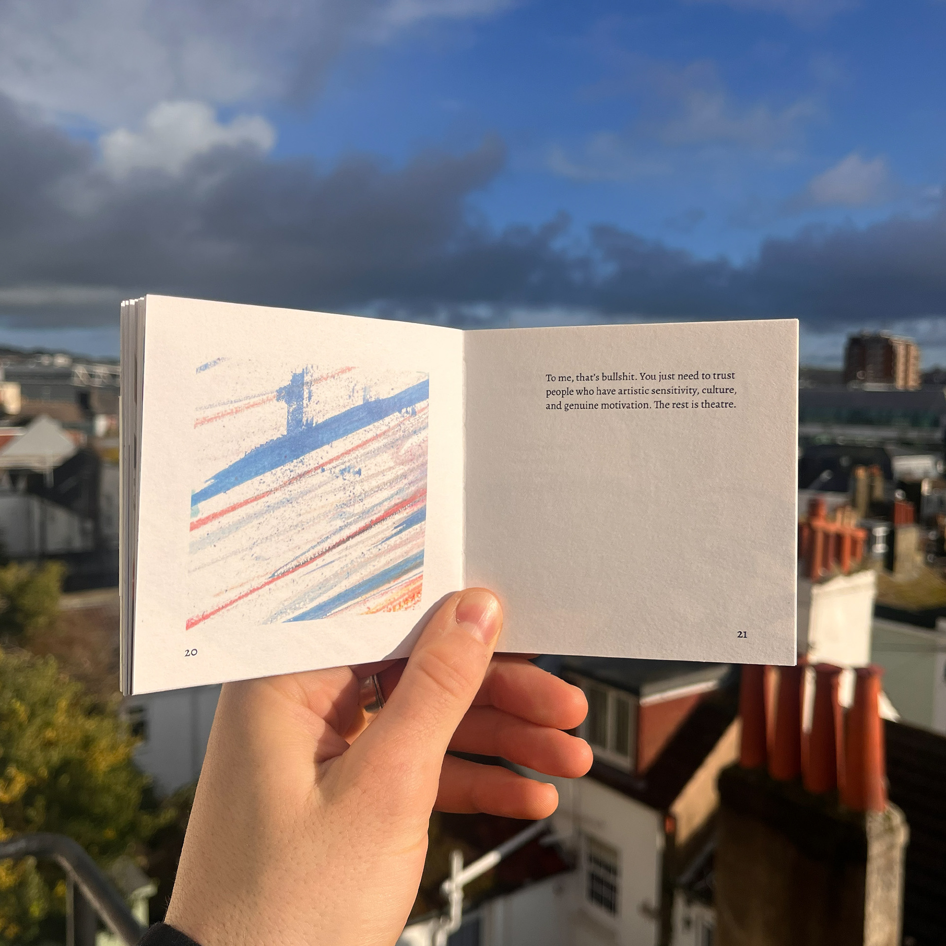
Spread with text and a scan of a texture I created using water colours, inspired by textures found in graffiti.
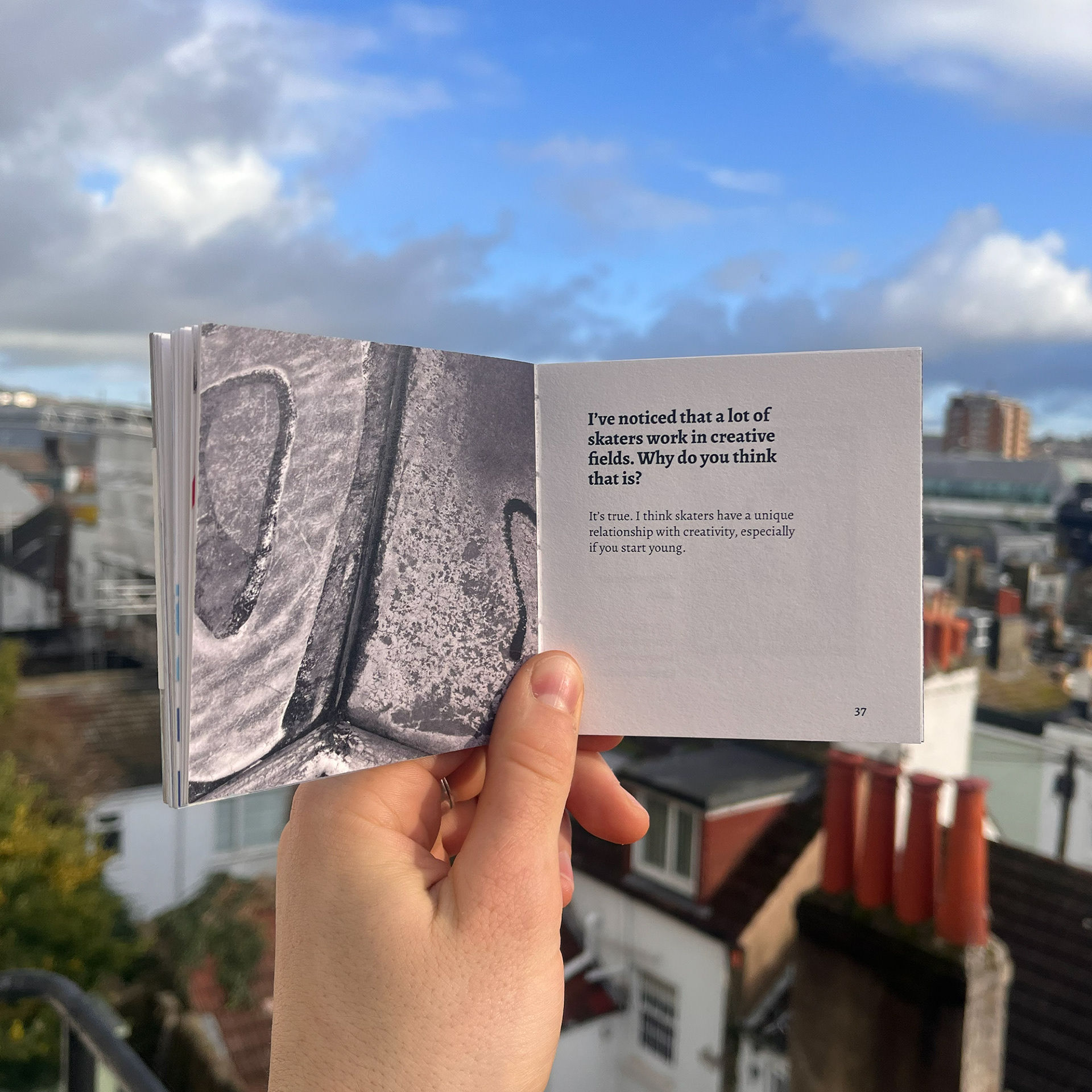
Spread with close up image I took of a concrete ramp and graffiti, tying to themes discussed in the interview.